Twittering machines« is the motto of this year’s summaery – what was the first thing this concept made you think of and how did your initial impressions shape your work?
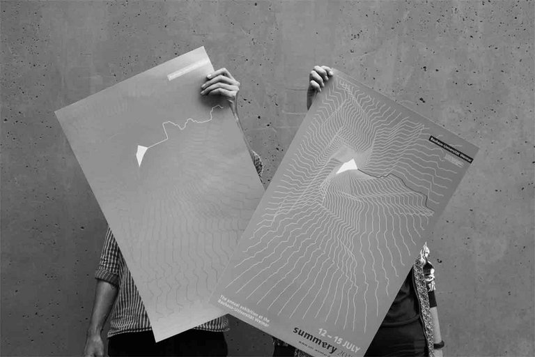
Building on our own research and also on the Faculty of Media’s accompanying text for the topic of this year’s summaery, we focused our attention on two main questions: what does a twittering machine look like and what does a twittering machine produce? We then tried to find answers to these two questions. The idea of designing our own twittering machine was of course a rather appealing one. As regards summaery and its role for the university, we felt that it would be more appropriate to work on the second question, as both instances are about communication from the inside out. The poster and our entire design are intended to showcase twittering machines at the university, rather than just serving as one.
A particular auditory meaning seems to have virtually overtaken the term ‘twittering’ – and in fact, the leitmotif initially makes us think of visualised sound unfolding from the centre of the poster. What is the central graphic idea behind the poster?
We like the fact that the design works at first glance – at the beginning, the graphic field still had a very broad definition, and we took an »in depth« look in various iterations until we arrived at the final variant, which is both graphically diverse and yet clearly communicates the auditory component.
The central graphic idea consists of three aspects: the first is a visualisation of sound, of what is coming out of the twittering machine. In addition, inspired by the text on the topic, it was important to us that the design created space and captivated viewers. The third concern was to represent diversity, on the one hand as regards twittering as something very natural, and on the other the diversity of summaery itself.
We incorporated all three points by recording the terms and words relating to the annual exhibition and then interpreted them in graphical form as sound. We experimented extensively with the visualisation in order to achieve a pull and an impression of depth. Variance also comes from the fact that different media depict different words.
What was the central challenge of the design?
The first challenge was without a doubt the decision to work with sound recordings, as neither of us had any experience in this area. First of all, therefore, we had to figure out how we would transform our voices into sound curves. From a conceptual perspective, there were two major questions for us to answer: firstly how we could combine sound visualisation with space, and secondly how we could cover the variance and variability of »twitterers« yet still develop a consistent design that would serve as a common thread across all media.
»Trial and error«, or the consistent pursuit of the initial idea – how would you describe the origination process from initial idea to finished product?
Once we had clarified the conceptual and visual focal points and they had been signed off by the university committees following numerous presentations, we began experimenting widely with sound curves as part of the specific implementation process. Even at the very beginning, we tried out lots of things without knowing exactly how the product would finally turn out – we allowed ourselves to be guided by the graphics.
Once the experimentation phase was complete and we established how the line graphics would look, we made certain key decisions, such as how much space the pure graphics would receive or where the lettering would be positioned. The devil was then truly in the detail of the framework we set, and much work went into the final touches.
